
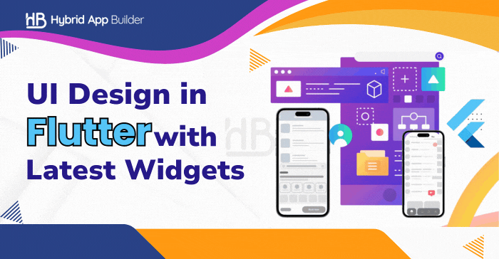
Flutter has revolutionized cross-platform app development, enabling developers to craft visually stunning and high-performance applications from a single codebase. As we step into 2025, Flutter continues to evolve, introducing new widgets and design paradigms that enhance user interfaces (UI).
This article delves into mastering UI design in Flutter using the latest widgets available in 2025, offering insights and technical guidance to help you create modern, responsive, and engaging applications.
Understanding Flutter’s Widget-Based Architecture
Flutter’s widget-based architecture is central to its design. Flutter treats everything as a widget, from layout components like rows and columns to gadgets like buttons and text inputs.
This modular approach enables developers to create sophisticated UIs by combining basic widgets, boosting reuse and maintainability. Flutter provides a rich catalog of widgets, categorized into:
- Visual Widgets: Text, Images, Icons, and Animations.
- Structural Widgets: Containers, Rows, Columns, and Padding.
- Interactive Widgets: Buttons, Gesture Detectors, and Switches.
- Platform-Specific Widgets: Adaptive widgets that adjust based on the OS.
By understanding these categories, developers can better utilize Flutter’s robust UI capabilities.
Also read: Flutter’s Impeller Engine: Enhancing UI Performance for Modern Apps
Embracing Material Design 3
Material Design 3 (MD3), introduced by Google, represents the latest evolution in design guidelines, emphasizing personalization, accessibility, and adaptability. Flutter’s integration with MD3 empowers developers to implement these contemporary design principles seamlessly. Key aspects of MD3 include:
- Dynamic Color Schemes: MD3 supports dynamic color theming, allowing applications to adapt their color palettes based on user preferences or system settings.
- Updated Components: MD3 introduces refreshed UI components with new shapes, elevations, and transitions, enhancing the overall user experience.
- Enhanced Accessibility: Focus on accessibility ensures that applications are usable by a broader audience, incorporating features like improved contrast and scalable typography.
By leveraging Flutter’s support for MD3, developers can create applications that are both modern and user-centric, aligning with the latest design trends.
Leveraging Advanced Widgets in 2025
Flutter’s ecosystem continually expands, offering new widgets that cater to evolving design requirements. Here are some of the latest widgets introduced in 2025 that can elevate your UI design:
1. FittedBox
The FittedBox widget is responsive, scaling and positioning its child within itself based on fit attributes. This ensures that the child widget fits within the available space without overflow, maintaining the design’s integrity across different screen sizes.
2. Flutter Arc Text
The Flutter Arc Text widget allows developers to display text along a curved path or arc. This is particularly useful for creating unique headings or decorative text elements that require a non-linear layout, adding a creative flair to the UI.
3. StreamBuilder
StreamBuilder is a sophisticated widget that creates itself depending on the most recent snapshot of interaction with a stream. It is required for managing asynchronous data streams, such as live data feeds or user input events, which enable dynamic and responsive user interfaces.
4. Numeric Keyboard
The Numeric Keyboard widget provides a customizable on-screen keyboard tailored for numerical input. This is particularly beneficial for applications that require precise numerical data entry, such as financial apps or calculators, enhancing user experience by offering a dedicated input method.
Implementing Responsive Layouts
Creating responsive layouts is crucial in delivering regular user experience across different devices. Flutter offers several widgets that facilitate responsive design:
- LayoutBuilder: This widget builds a child widget tree that can depend on the parent widget’s size constraints, allowing for adaptive layouts based on available space.
- MediaQuery: Gives information about the current device’s size and orientation, allowing developers to modify patterns and style accordingly.
- Adaptable and Expanded: These widgets regulate how a child of a Row, Column, or Flex grows to fill available space, allowing for a greater variety of designs.
Using these widgets, developers may guarantee that their apps give the best viewing experience possible, independent of device specs.
Enhancing User Interaction with Animation
Animations play a pivotal role in creating engaging and intuitive user interfaces. Flutter’s animation framework allows developers to add motion and transitions that enhance user interaction:
- AnimatedContainer: A widget that automatically animates characteristics such as ornamentation padding, alignment, and others as they change, providing for seamless transitions.
- Hero Animations: Enable shared element transitions between different screens, providing a seamless navigation experience.
- AnimatedBuilder: A general-purpose widget for building animations, offering fine-grained control over the animation process.
Incorporating these animation widgets can significantly improve the user experience by making the application feel more responsive and alive.
Best Practices for UI Design in Flutter
To master UI design in Flutter, consider the following best practices:
- Consistent Theming: Maintain a consistent theme throughout the application to provide a cohesive user experience. Utilize Flutter’s ThemeData to define colors, fonts, and styles.
- Accessibility: Ensure that your application is accessible to all users by implementing proper semantics, contrast ratios, and scalable text. Flutter’s accessibility widgets can assist in this endeavor.
- Performance Optimization: Optimize the performance of your UI by minimizing widget rebuilds, using efficient state management techniques, and leveraging Flutter’s profiling tools to identify bottlenecks.
- State Management: Implement effective state management solutions to handle application state efficiently.
- Code Organization: Structure your codebase logically by separating concerns, such as UI, business logic, and data access layers. This enhances maintainability and scalability.
Options include Provider, Riverpod, and Bloc, each offering different approaches to managing state in Flutter applications.
Conclusion
Flutter’s UI capabilities have significantly improved in 2025, offering new widgets and advanced design patterns to create immersive applications. By leveraging Material Design 3, advanced widgets, responsive layouts, animations, and best practices, developers can build stunning, high-performance Flutter apps.
Staying updated with Flutter’s evolving ecosystem is key to mastering UI design. Whether you’re designing a personal project or an enterprise application, applying these techniques will help elevate user experience and usability.
Ready to experiment with the latest Flutter widgets? Start implementing them in your next project and take your UI design skills to the next level!
HybridAppBuilders
Latest posts by HybridAppBuilders (see all)
- How Does React Native Handle Complex UI & Native Performance - June 13, 2025
- How to Handle State Management in Vue.js for Large-Scale Apps - June 5, 2025
- Migrating from Xamarin.Forms to .NET MAUI: a step-by-step guide - May 29, 2025